Content redesign to reduce support burden
I led research and design of content in FloowDrive: an app that uses drivers’ driving behaviour to generate a safety score. Insurance companies use it to offer better rates to safe drivers.
Impact:
📉 Reduced support burden by 63%
🌟 User satisfaction increased by 34%
🎯 Aligned cross-functional teams around one shared vision
✨ Better visual and structural consistency across client apps
Product Design Lead
My role
The Floow
Company
IOS, Android, backend and QA engineers; data science
Team


Problem
Drivers complained they didn’t understand how their scores work and what to do to improve them.
Key business and User needs
Business needs: Reduce user complaints, build trust in the scoring system, and maintain strong partnerships with insurance companies.
User needs: Provide clarity on driving scores and actionable guidance to help users improve their behaviour and benefit from lower insurance rates.
Ran a full content audit to identify gaps and inconsistencies
I organised a series of workshops with the data science team to gain a deep understanding of the scoring system. I then created a definitive source of truth, enabling everyone in the company to access and learn from it.

Designed and implemented a feedback card to gather insights from users across all clients (2,000+ responses)
Lacking clear client data, we used the feedback card to identify the main issue: mobile use. It became our top priority. We also measured overall satisfaction, which was just 2.4/5.
Education problem
Drivers felt unfairly penalised by perceived score inaccuracies, with some describing the app as "trying to get you."
“I keep getting told to get off my phone even though I don’t go on it. My phone can be in my bag yet says I was on it. Awful!”
Guidance problem
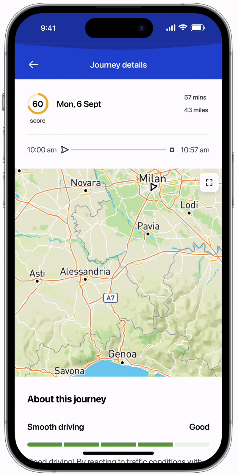
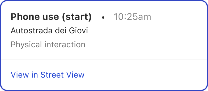
Although the app included a map displaying driving events, it lacked explanations for what those events meant. This ambiguity made it difficult for drivers to understand how to improve.
Mapped the end-to-end user journey of checking a drive score, including user emotions and barriers

Run a series of workshops to facilitate collaboration

I used the journey map in three remote workshops to help cross-functional teams visualise user frustrations, build empathy, and collaboratively ideate, critique, and evaluate potential solutions.
Designed & Run 3 rounds of remote, moderated usability tests
I tested:
Content discoverability: Can users find previously hard-to-locate info?
Tone of voice: Are the words and terms clear and simple?
Use-case scenarios: Do users understand how the distraction score works?
Over the course of 18 weeks, I redesigned how content is discovered, organised, and written.
Prototype
The prototype includes interactive features such as the driving insights page, new educational articles, and a transparent score breakdown page. It also showcases the improved map experience, with event descriptions and links to see the events in Google Maps.

The solution improved usability and user satisfaction which was expected to lead to better user retention
However, as I left the business not long after delivery, I was unable to track the long-term results.
Reduced support burden by 63%
Increased user satisfaction by 34%
Better alignment of DS components
Better consistency across client apps
Reflection
I wore many hats — researcher, content strategist, UX and UI designer — and found this complex, multi-dimensional project incredibly rewarding. With limited resources, I stepped into multiple roles to ensure momentum and clarity. While it would have been valuable to collaborate with a dedicated content designer, the experience taught me how to bridge that gap effectively.