ExpertIn
An app for connecting students with experts
PRODCT DESIGN

Project info
The project took 5 months to get it to a stage of validating high-fidelity designs
The team on this project included:
Methods
Research
Usability Testing
Preference Testing
Prototyping
User Flow
Affinity Mapping
User Journey Map
Design Language Systems
Sitemap
Tools used
Balsamiq
Sketch App
InVision
Marvel App
Usability Hub
Optimal Workshop
iMovie
Skype
Project background
ExpertIn is a web app that connects students and experts online. The web app enables students to find an expert that can provide them with feedback on their work. The communication happens during video calls. The area of expertise includes mainly students and experts from a design field.
App demo: ExpertIn Demo.
App demo
Project details
Problem statement. People in creative fields need a way to connect with experts in their fields because they want to receive feedback on their work.
Possible problems:
There are already many established apps that help to connect experts with students.
Acquiring users to use the service (both students and experts) and then converting them into frequent users can be difficult.
Motivating users (both students and experts) to use the app can be challenging.
Solution. An app that helps students find expertise from reliable experts.
Competitor analysis
To identify the market my app was entering I decided to conduct a competitor analysis. I used the SWAT Analysis method to help me organise my thoughts. This helped me narrow down these apps’ weaknesses and cleared out opportunities for my app.
I looked into two apps: Jinitto and Quora.

Quora app - analysis

Jinitto app - analysis
Research and interviews
To gain a better understanding of my potential users I run a survey with 20 people and conveys interviews with three potential users. All of my participants were English speakers, in creative industries and were 18 and over.
Research goals
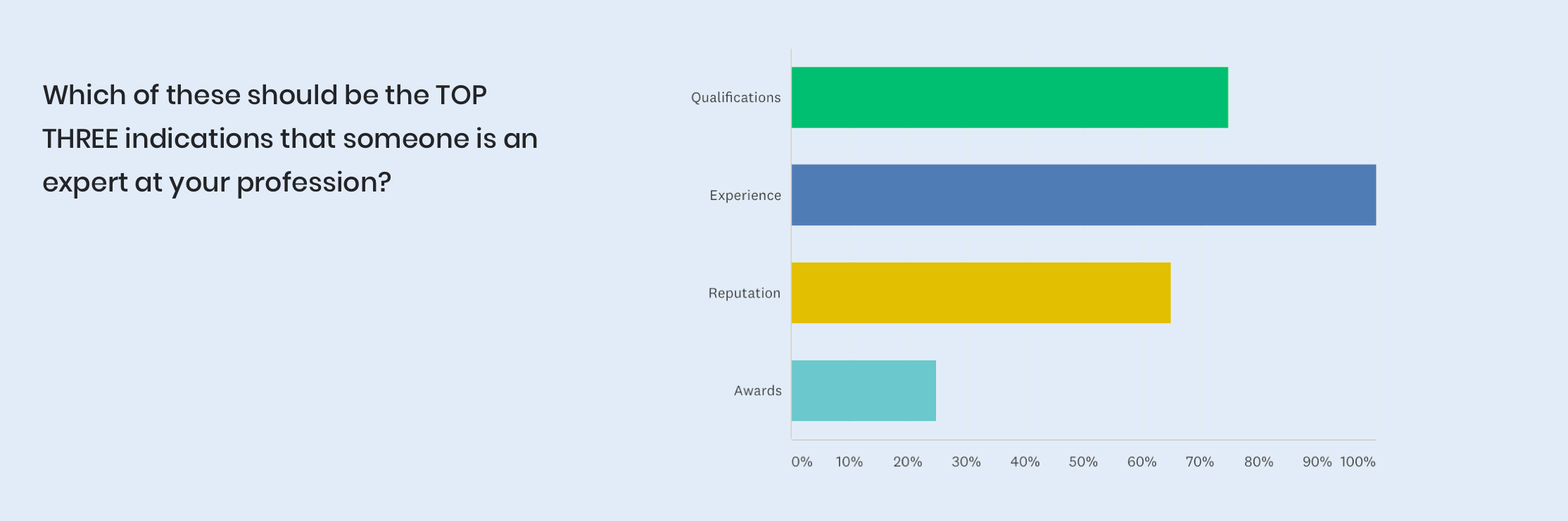
To learn who the users identify as an expert.
To identify what is the current experience users have if they want to obtain feedback on their creative work.
To learn what is a preferred way of receiving feedback from experts and how the users would like to pay for it.
The following are just a few findings from the survey I run.


Meeting users’ needs
A clear description of the experts’ experience within the field
Clarity on what the experts’ expertise is
To use the language of the users. Most of my participants usually gain feedback from their colleagues and communicate with a simple tone of voice.
Choice of packages on expertise feedback, e.g. scheduling of a video call with a pre-recorded feedback, and scheduling of just a video call.
An ability to reach out to its potential users via Facebook groups and forum groups in a particular expertise.
Clarity on what kind of feedback is expected from the .
To offer mentorship programs (as a way of motivating the users to come back and use it again).
User development
With the information gathered, I created an ideal user persona, and a user journey—that show the user’s experience when they look for an expert using the app—as well as the user flow.

Persona

User journey
Sitemap
The following sitemap shows how a user could experience the app when using it as an expert or/ and student:

Sitemap
Usability testing
After creating my low-fidelity prototypes I conducted a usability test with 6 participants who were between 21 – 50 years old (3 males and 3 females). It was performed both in-person and remotely. In-person testing: it took place at the participants’ company (with four participants); remote testing (with two participants) using Skype and Facebook messenger. Both of the tests were moderated and recorded (with the participants’ consent).
The goal of this usability testing was to establish learnability for new users who are interacting with ExpertIn for the first time. The participants acted as potential ‘students’ of the app and used both a mobile and a desktop device. During this usability testing I asked my participants to complete the following scenario tasks:
You’ve prepared a marketing campaign for your partner’s job. You now need some professional feedback on it. Using ExpertIn, find an expert that could provide you with feedback on this marketing campaign.
You’ve found a person (Daniel Lewis) that is shown to be an expert in ‘marketing’. Visit their profile and provide more details on your project (including providing them with a copy of your marketing campaign). Note that you usually store your files in Dropbox.
You’ve now provided more details on your work to the expert. Select 4th of March, noon, as the date and time you want to have a call with the expert.
For a detailed look of the Usability Test Script, feel free to explore it here: https://drive.google.com/open?id=1kAxxOxVhr63KKLWJzz6WBxUgpHA1wRn5.
Usability testing findings
I gathered approx. 3hrs of recordings. With so much data I decided to organise it by creating an affinity map and divide them into four categories: Positive Quotes, Negative Quotes, Observations, and Errors. This gave me a meaningful overview of the problems with the app:

Affinity map
Issue #1
Confusion with a new page being opened after clicking on the search field (on a mobile) and uncertainty if the searched experts are experts in the field they were searched in.
Suggested change: Do not take users to a new page and add expertise tags to every expert.

Issue #1 - Before the change

Issue #1 - After the change
Issue #2
Confusion with what the ‘Check’ icon means (if noticed at all).
Suggested change: Change the ‘tick’ icon to either ‘Save’ or ‘Done’.

Issue #2 - Before (left) and After (right) the change
Issue #3
Intimidated by the number of boxes to fill out in order to contact the expert; inability to decide what information to include.
Suggested change: Combine the boxes into one and provide suggestions (potentially in a form of templates?) on what information should be provided to an expert.

Issue #3 - Before (left) and After (right) the change
High-fidelity prototype
The app’s final look and feel (on a mobile device) can be seen below or previewed live by following this link: ExpertIn InVision Prototype. You can also view a demo of it on YouTube by following this link: ExpertIn Demo.


Signup screen
Email signup screen


Filled email signup screen
Loading screen


Experts screen
Search functionality


Smart search suggestion
Filtered search results


Expert screen
Contacting the expert


File upload
Call booked
Design system
To provide a guide for the design style and aesthetic for ExpertIn, I also created a basic Design System. This document will be updated accordingly and provided to the team to ensure unity in design across multiple platforms.
Learnings
Whilst working on this project, I was reassured again of the power of iterative process in design. This project allowed me to run my solutions to UX problems by my potential users, and then introduce their feedback into my designs. It’s been an invaluable experience that allowed me to provide the best user experience whilst also empathising with business goals.
Thanks for reading!